Amazon Feature Design
Amazon feature design project focused on creating a user-friendly platform for natural/humanitarian support for affected people
Background
The news was a constant buzz of "Ukraine crisis." My heart ached, but watching others donate felt passive. I craved impact, so I dug into a secret Amazon project: designing a feature for Ukraine that went beyond just throwing money at the screen.
Solution

Rising Action
I ditched spreadsheets and grabbed my sketchbook. User interviews became my treasure maps, revealing hidden pain points: people wanting to send more than cash, craving updates on their donations, and a place to share the emotional burden.
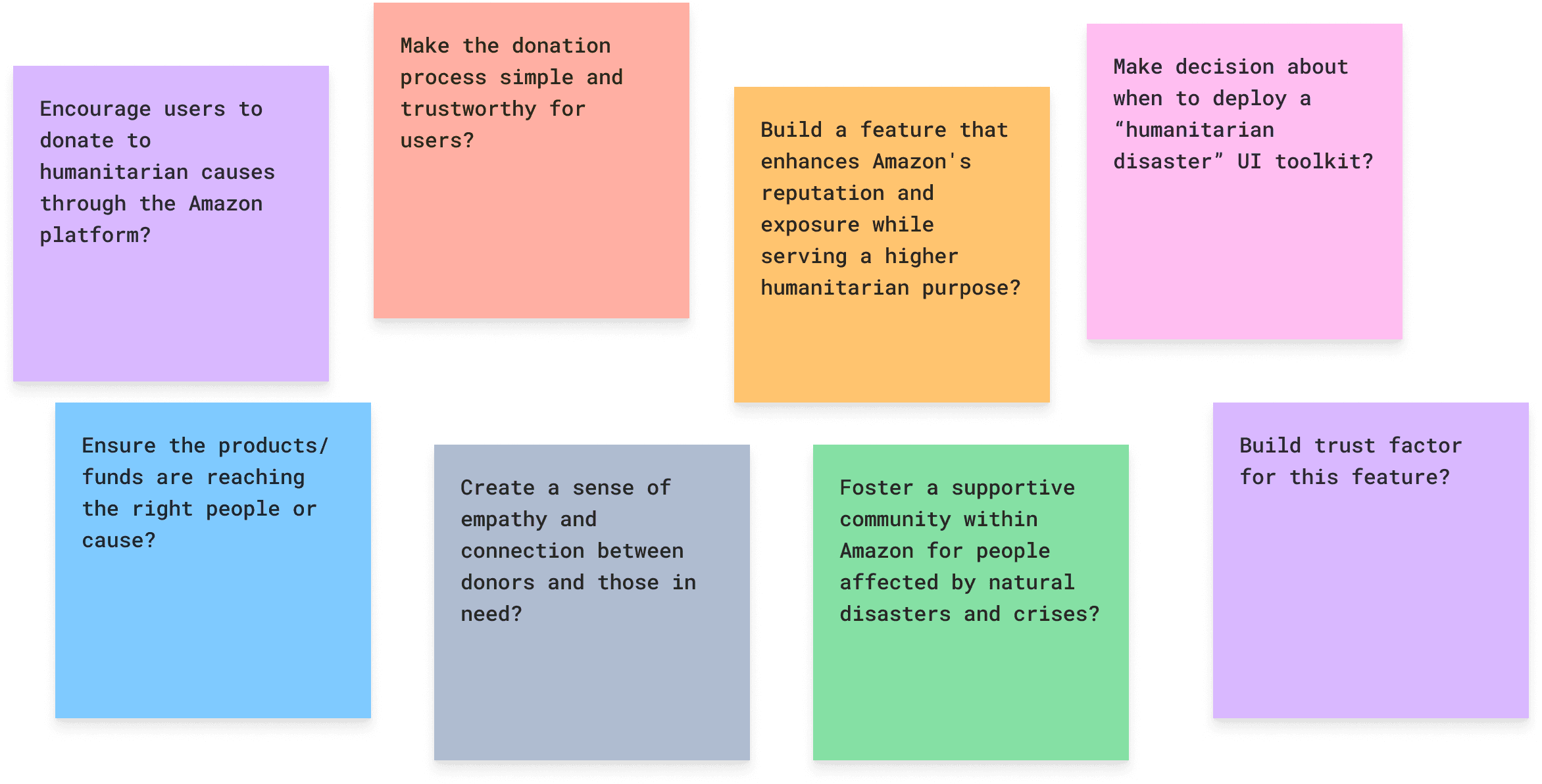
How might we?
Making important "How might we?" inquiries was the first step in my search for answers. These questions served as guiding stars, highlighted the way forward. My challenges included How might we generate empathy for citizens of one country without disparaging citizens of another country or community?
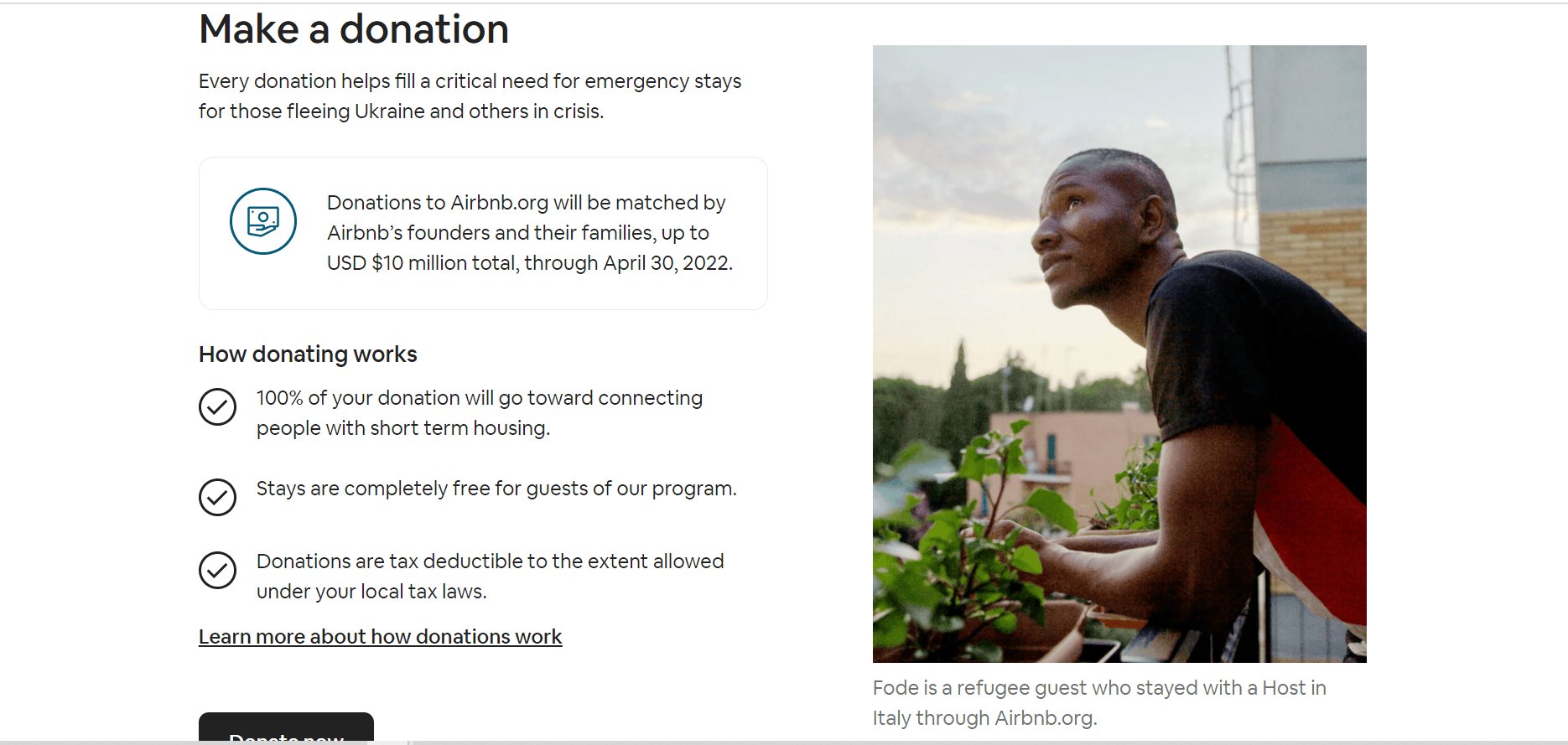
Rapid competitive research
Competitive analysis helps identify key market players, determine their winning strategies, and identify resources that a business can use to dominate the market.
A quick competition survey was conducted here to gather information on similar types of applications that customers are making available to donate to the people of Ukraine.
The aha moment struck like a bolt of lightning! A mobile app feature, a digital lifeline for Ukraine. Not just donations, but a "shop for essentials" feature, a community forum for support, and an Amazon Pay option for seamless giving. I could practically hear cheers from grateful users.
Scaling process and Design
Translating these questions into mobile app sketches helped me explore solutions and visualize how the feature could work in practice.
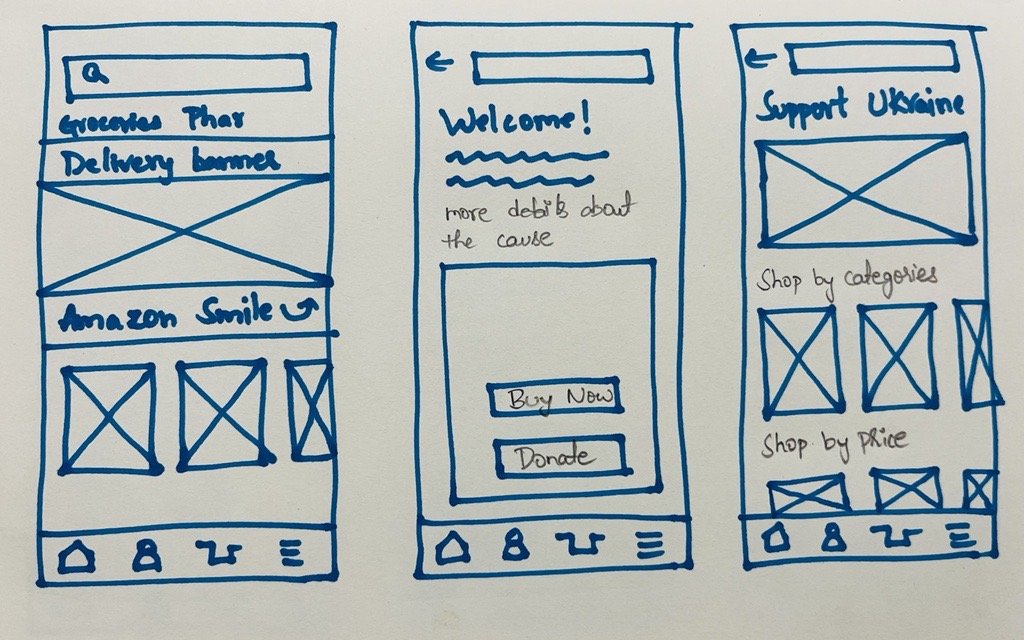
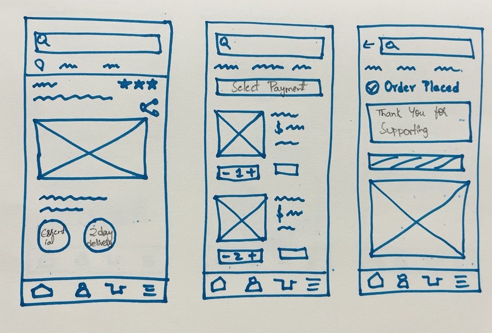
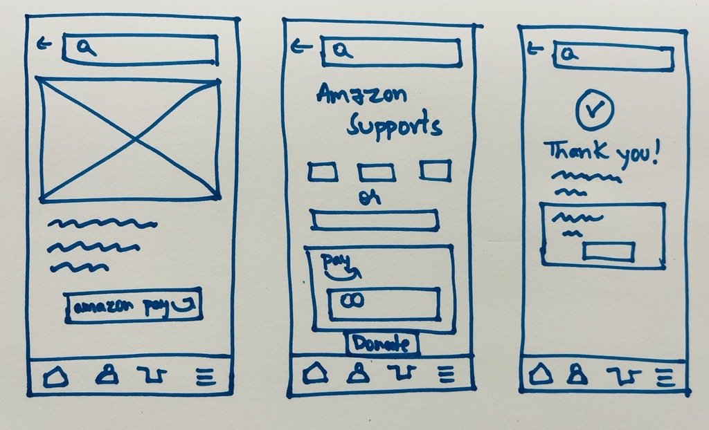
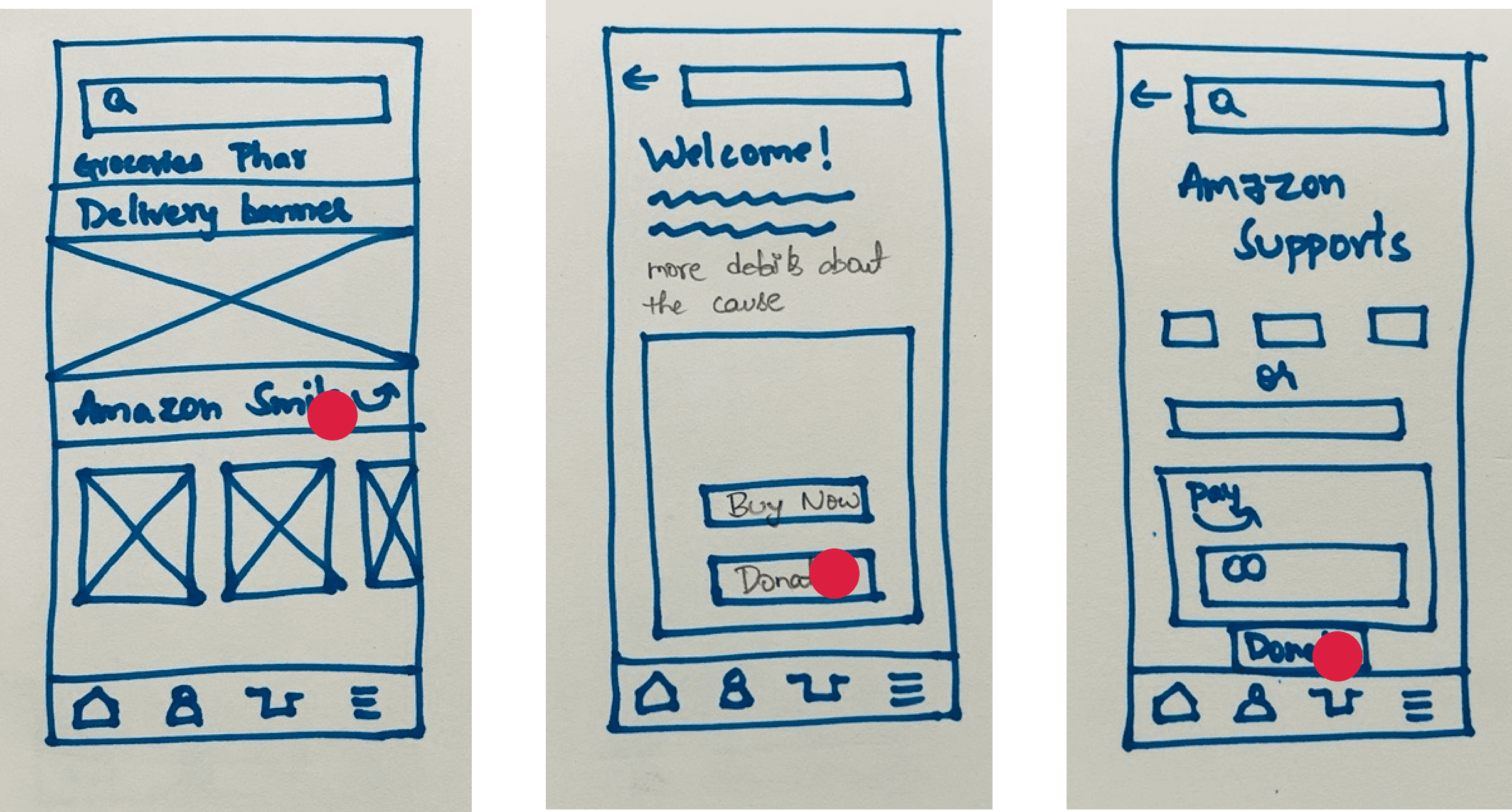
The turning point arrived when I recognized the significance of openness and user confidence. I drew out several design concepts and conducted Dot voting to establish specifications. This method made guaranteed that the user's perspective was front and center while also streamlining the design process.
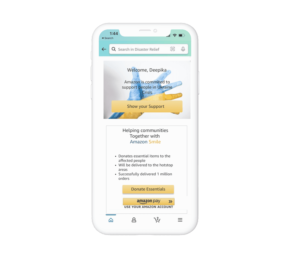
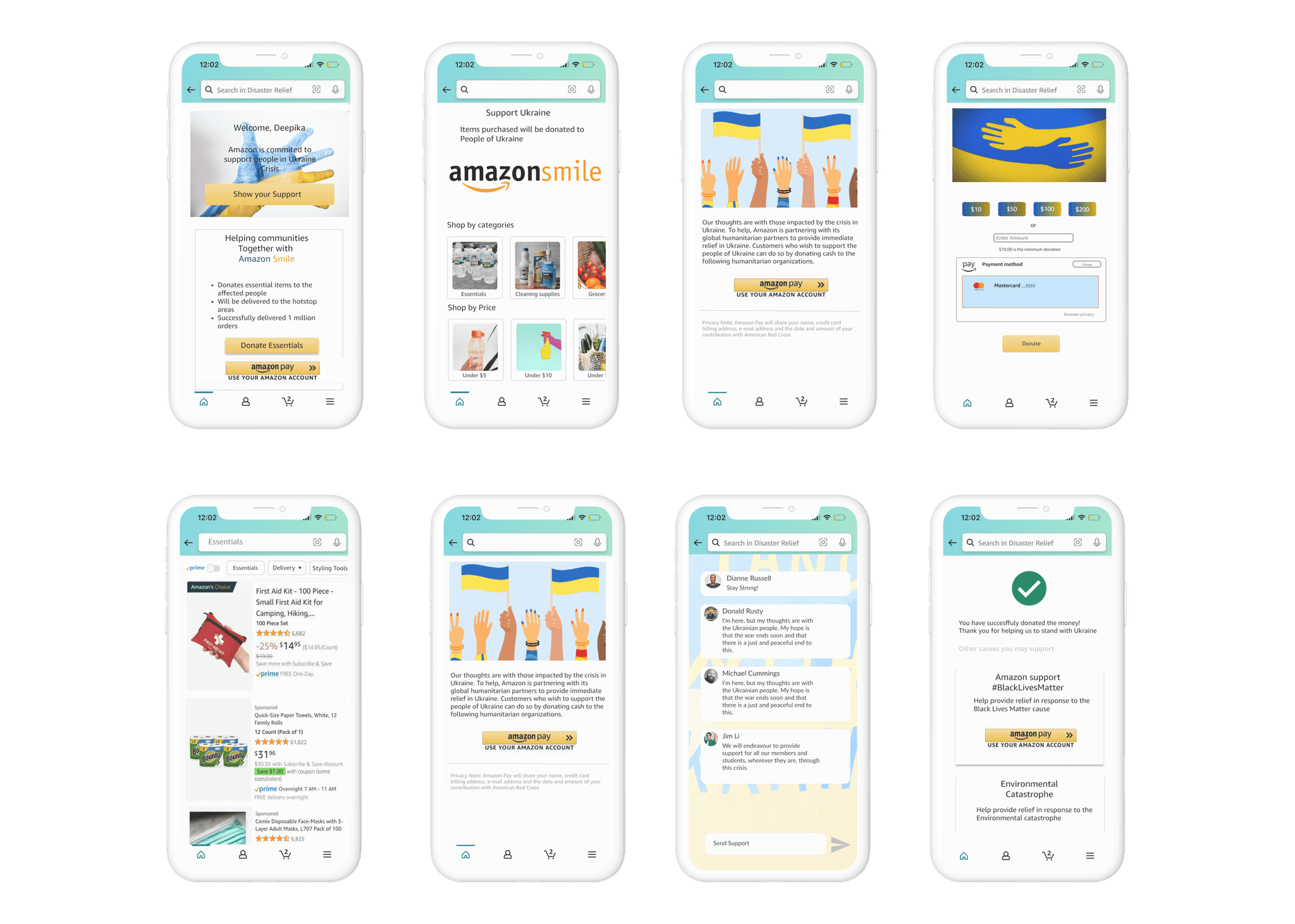
I went over the process for the donation page and the shop essentials feature in detail, holding high-fidelity prototypes in my hands. In addition, I made a community area on the site to offer moral support in times of crisis and natural disasters. The goal of this all-encompassing strategy was to fully address the requirements and concerns of the user.
Donation Page
Donors who are willing to donate essential items to affected people rather than just providing monetary funds
Detail information of how the items donated are put to the right use
Additional feature to donate through amazon pay
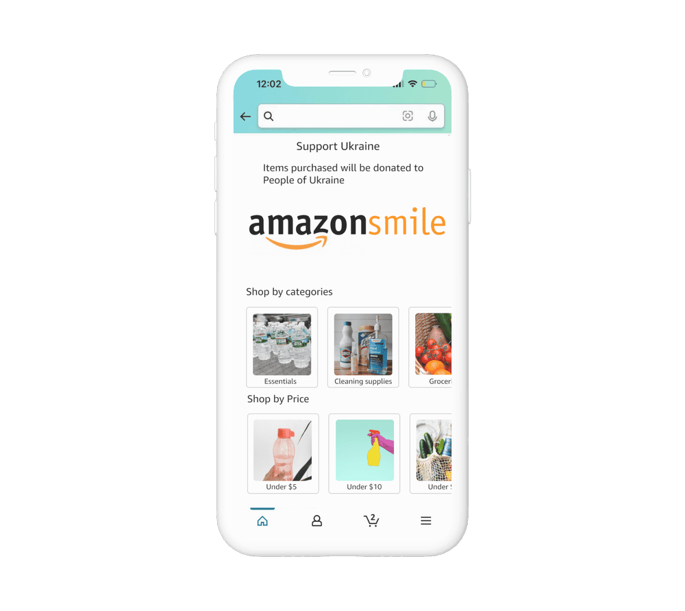
Shop Essentials
Supporting Ukraine people by sending out essential items to support their daily needs
Can easily be deployed for other humanitarian causes in future
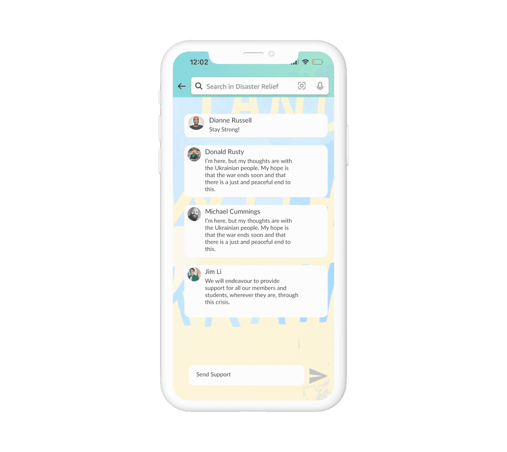
Moral support
Created a community where people from all over the world and show their grief and support to the affected
Moral support is more important than money in such hard times
Conclusion
Holding the final version of the app in my hands, I couldn't help but feel a wave of bittersweet accomplishment. It wasn't just the technical hurdles overcome, the feedback incorporated, or the lives touched. It was the knowledge that my "How might we?" spirit, channeled through design, had made a tangible difference. This journey taught me that innovation isn't just about fancy features or sleek interfaces; it's about asking the right questions, listening deeply, and crafting solutions that resonate with the human heart.
